
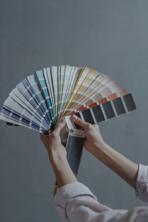
Creating a calm and inviting atmosphere in your home often starts with the colors you choose for your walls and décor. Colors have the power to influence our mood and energy, so selecting calm colors can help foster relaxation and tranquility. Whether you’re redecorating your living room, bedroom, or any other space, this guide will help you pick soothing hues that make your home a peaceful retreat.
Why Choose Calm Colors?
Calm colors are typically soft, muted tones that evoke feelings of serenity and comfort. These colors can help reduce stress, improve focus, and promote restful sleep. Unlike bold or bright shades, calm colors don’t overwhelm the senses, making them ideal for spaces where you want to unwind or recharge.
Some benefits of calm colors include:
– Creating a cozy, welcoming environment
– Enhancing natural light and room brightness
– Complementing various décor styles
– Providing a timeless look that stays fresh
Popular Calm Color Families
Before choosing a paint color, it helps to know which hues are known for their calming effects. Here are some popular options:
Blues
Soft blues are among the most calming colors. Shades like powder blue, sky blue, and muted teal remind us of water and sky, which naturally soothe the mind.
Greens
Gentle greens, such as sage, mint, and olive, bring the calming essence of nature indoors. Green is also easy on the eyes and can balance energy in a room.
Neutrals
Warm neutrals, including beige, taupe, and soft grays, create a peaceful and versatile backdrop. They blend well with most accent colors and textures.
Lavenders and Soft Purples
Light purples with gray undertones, like lavender and lilac, offer a subtle calming effect while adding a touch of elegance.
Tips for Choosing Calm Colors for Your Home
1. Consider the Room’s Purpose
Think about how you use each room before choosing a color. Bedrooms benefit from soothing shades that promote relaxation, like soft blues and greens. Living areas might call for neutral tones that invite conversation and ease. Home offices can use calm colors that boost focus without being distracting.
2. Test Colors in Different Lighting
Paint colors can look different depending on the light—natural daylight, warm indoor lighting, or shadows. Try painting small swatches on your walls and observe them throughout the day to see how they change.
3. Use Color Samples and Chips
Take home color samples from your local paint store and view them next to your furniture and décor. This helps ensure harmony and balance in the room’s overall look.
4. Pair Calm Colors with Texture and Accents
Calm colors provide an excellent foundation for adding texture through materials like linen, wool, wood, or ceramics. Use accent pillows, rugs, curtains, or artwork in subtle patterns and complementary colors to enhance the room’s depth.
5. Keep Undertones in Mind
Colors contain undertones such as warm (yellow, red) or cool (blue, green). Select calm colors with undertones that match other elements in your home. For example, a calm blue with gray undertones works well in modern spaces, while one with green undertones suits more natural décor.
6. Opt for Matte or Satin Finishes
The finish of your paint can affect the feeling of calmness. Matte or satin finishes tend to absorb light softly and create a soothing atmosphere compared to glossy finishes, which reflect more light and draw attention.
Creating a Balanced Color Palette
To maintain a peaceful vibe, balance your chosen calm color with complementary shades. A well-rounded palette might include:
– Base Color: The main calm color covering most walls or large pieces.
– Secondary Colors: Soft shades that complement the base without overpowering it.
– Accent Colors: Light pops of a deeper or brighter shade used sparingly for interest.
For example, a soft sage-green room might pair well with warm beige and light cream accents, complemented by natural wood tones.
Common Mistakes to Avoid
– Choosing overly dark shades: While dark colors can be cozy, very dark tones in small rooms can feel heavy and less calming.
– Ignoring personal preference: Calm colors should still feel good to you. Don’t pick colors just because they’re trendy; pick what makes you feel relaxed.
– Overusing cool tones in warm climates: In very warm or sunny locations, too many cool colors might make a space feel chilly. Balance with warmer neutrals or natural textures.
Additional Ways to Enhance Calmness
Color is just one part of creating a relaxing home environment. Consider these extra touches:
– Soft lighting: Use lamps or dimmable lights to create a gentle ambiance.
– Natural elements: Include plants or wood accents to bring nature inside.
– Declutter: A tidy space feels more peaceful than a cluttered one.
Final Thoughts
Choosing calm colors for your home is a wonderful way to support your well-being and make your living space more enjoyable. By thinking about the mood you want to create, testing colors in your environment, and balancing shades thoughtfully, you can turn any room into a calming retreat.
Remember, your home is your sanctuary—pick colors that help you feel at ease and happy every day. Happy decorating!
